Egue y Seta gives a twist to the “open plan” concept that has characterized many houses for years and gives birth to Un lofting almogavers.
The interior designers responsible for the project, Daniel Pérez and Felipe Araujo comment that “just when we thought “open plan” was forever, that we would never build a new wall again, and that, with time, everyone would become used to showering in the middle of the living room… a sensible couple walks in, and asks us to “separate what God has united”.
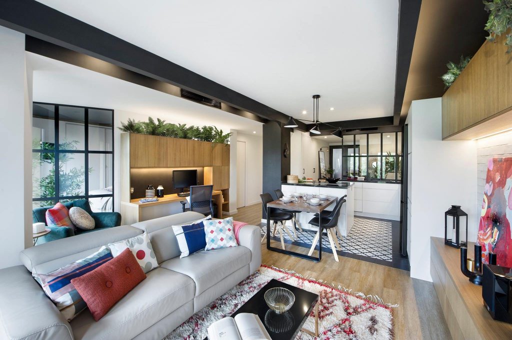
The intervention involves the reconfiguration of a flat in Barcelona, converted not long ago into a loft, into an a priori ‘more conventional’ apartment. Wide open space was one of the most popular real estate trends of the last few years. However, this project turns it around: without sacrificing visual permeability, it combines zoning by uses with versatility and a strong diaphanous character.
Industrial and compartmentalized
With the aim of re-providing the apartment with a private area differentiated from a more extroverted one, the project undoes the entire process that had previously converted the house into a loft. In it, Egue and Seta question this typology through a style where industrial aesthetics are not at odds with spatial compartmentalization. Material honesty and natural finishes coexist with a colorful textile and vegetal backdrop.
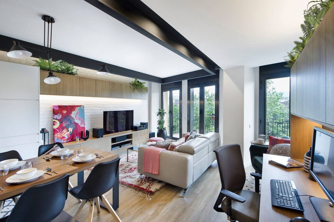
With 83 square meters, the house is organized into two different areas, perpendicular to the façade. The one with the large open space of the common areas and another more compartmentalized one, which houses the night area. The three balconies open to the street and the patio on the opposite façade favor cross ventilation.
Hall
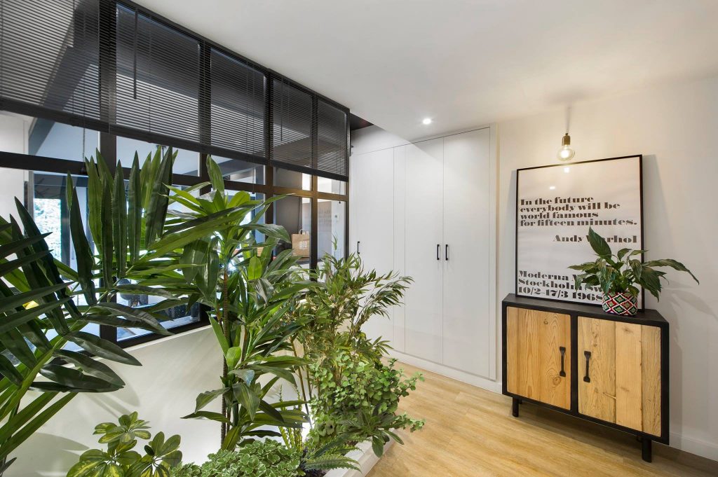
A hall flooded with vegetation welcomes the visitor. Half-height windows, with black carpentry with an industrial aesthetic, allow you to glimpse the kitchen-dining room-living room, which also houses a study area.
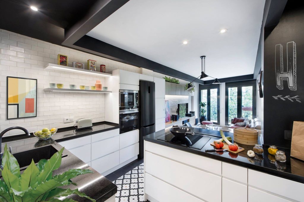
In the kitchen, a mantle of imitation hydraulic porcelain stoneware, by Vives, breaks the continuity of the flooring with wood-effect vinyl slats by Glerflor that covers the rest of the space. On the vertical walls, white paint has been combined with old subway-type tiles.
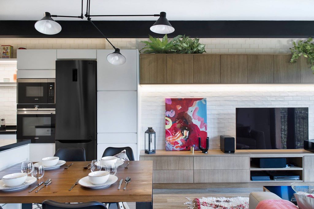
Made of oak wood, the TV unit and the desk have been made to measure for the project. Vegetation emerges above them, becoming one of the protagonists of the space.
A nod to the old loft
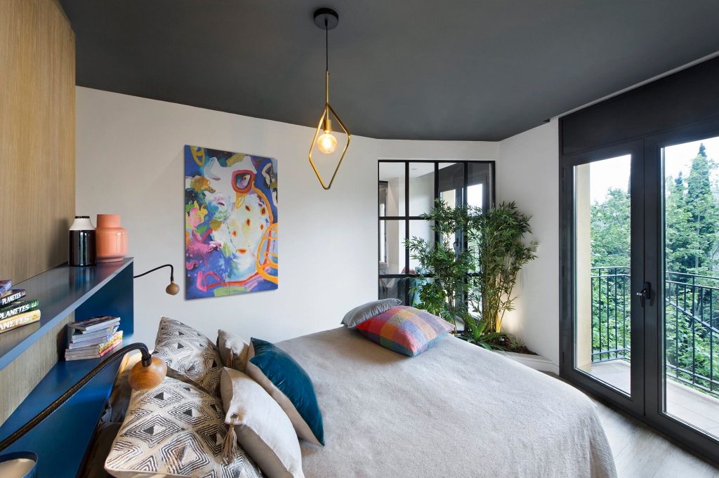
Behind the desk, and with access through a sliding door, is the master bedroom. With an open layout in reference to the old loft, the walk-in closet separates the bed from the bathroom. The wall lamps of the headboard of the bed are number 8 from Marset. A vegetal parterre with a paneled window visually communicates this room with the diaphanous space of the common areas.
The bathroom
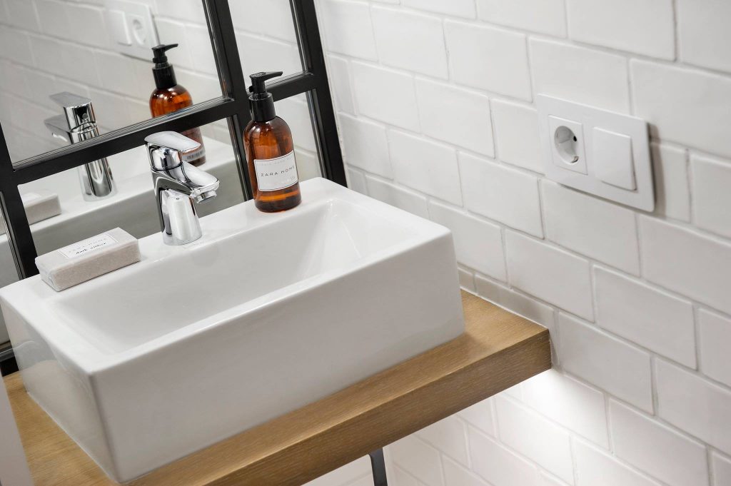
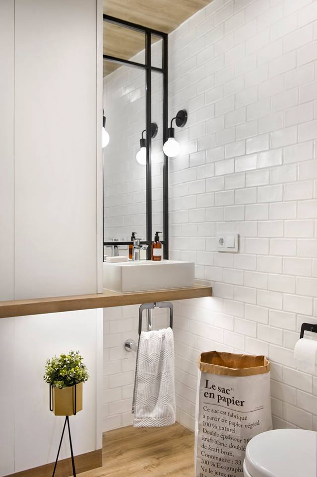
In the interior area of the floor, the secondary bedroom and its bathroom have been distributed in a ‘more conventional’ way. The mini porcelain countertop Gerona washbasin is by Bathco and, as in the rest of the spaces, the mechanisms are by Simon.
Photo: Vicugo Foto


