This project carried out by Almeda Estudi is named after its location: Plaça del Vi, a square with a lot of history located in the old town of Girona.
Plaça del Vi (Wine square in Catalan) is surrounded by noble buildings, traditionally (since the 15th century) dwelled by highborn families. recibe el nombre de su ubicación: una plaza con mucha historia situada al casco antiguo de Girona.
The project embraces a full refurbishing of a 135m2 space on the second floor. The building was erected using dimension stones and balconies with wrought iron rails.
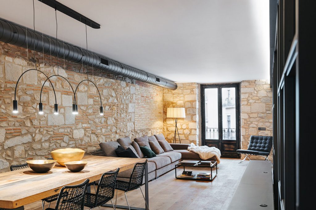
It has natural light from three facades. The stairs of the block follow the architectural uniqueness and the roots of the building, keeping the natural marble steps and the original elevator, with wood and wrought iron embellishments, visible cables and interiors reflecting the passage of time.
Originally, the apartment was divided into two clearly designated areas. The servants quarters, in the west, were less luxurious and more functional, with the kitchen, a drug storage area, a bedroom and a loo at the end of a narrow corridor. The owners’ area, in the east, was better illuminated and had views to the square and to Pont de Pedra (Bridge of stone in Catalan). The access was through a hall leading you either to the living room or a corridor connecting the two bedrooms and the toilette.
A qualitative leap for the property, without losing any of its soul and essence
Hoanna Giró, responsible of the study, comments that “the refurbishment implies a qualitative leap for the property, without losing any of its soul and essence. There are new openings to get a wider floor and provide new perspectives from all spots. The three facades and this more diaphanous vision, notably enhance the entrance of natural light, giving every surface extra illumination and brightness. Each space is redefined, and all spots grant the right user’s flow in terms of circulation, coherence and comfort“.
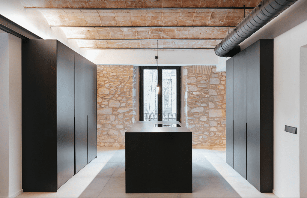
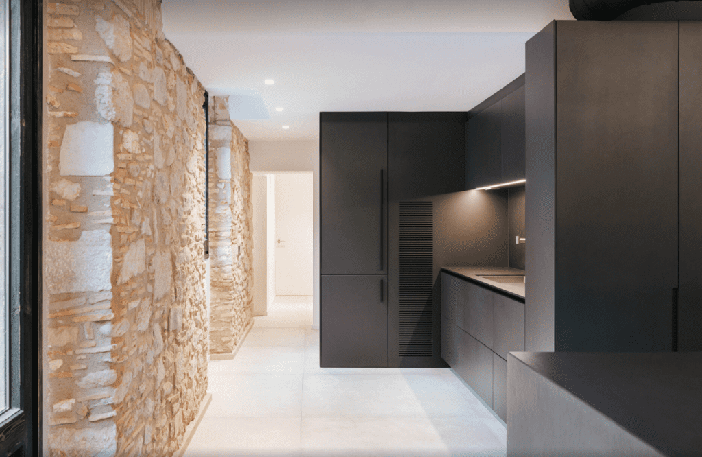
The daily area is located in the first shed, where we can also find the access to the residence. It includes a diaphanous surface where the kitchen, the dining area and the living area share space. Thanks to the balconies in both facades (east and west), this multipurpose hall is suffused with light and has a crossed ventilation.
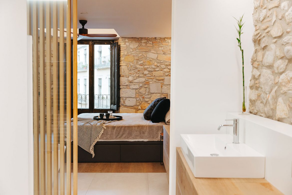
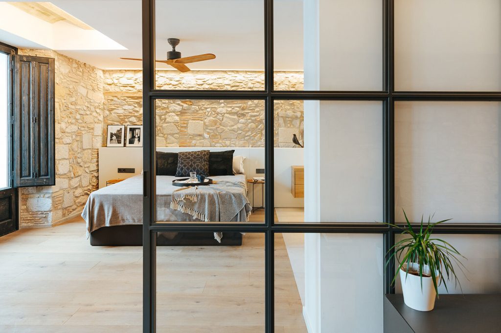
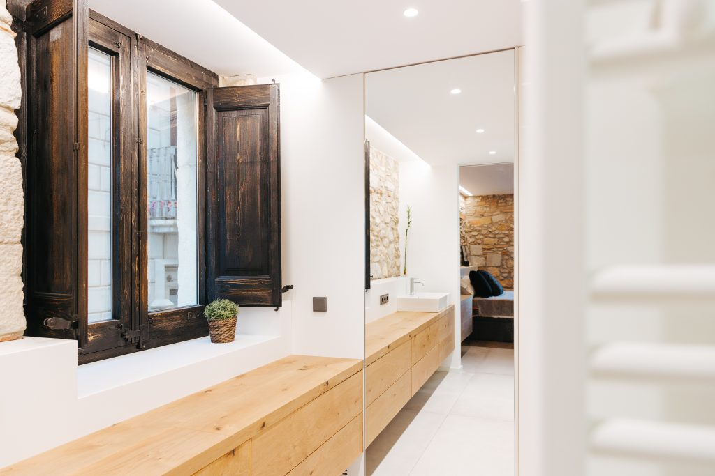
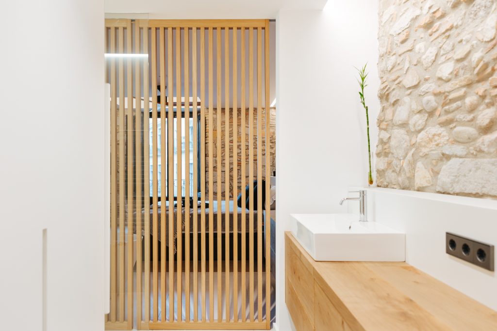
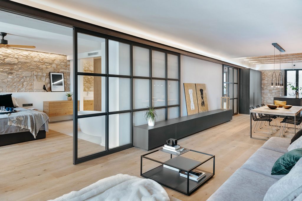
The nightly area is located in the second shed, and could actually be perceived as an elongation of the daily area, due to their close connection. The main suite and the library are totally open to the space, but they can be conveniently privatised using two sliding doors made of glass with metallic frames in an industrial style. They are an identity hallmark of the project. In the bathroom of the main room, the Brussels 70 washbasin is placed on custom furniture.
Mixing past and present, the intervention incorporates a sober play of materials in coexistence with the history of the premise. All elements and materials have been painstakingly restored, for instance, the stone walls, the arch, the original wooden openings.
Visual harmony is sovereign, and there is an ongoing dialogue between spaces and a play of contrasts given by the browns and ochres of the natural oak parquet, the stones and the black lacquers of the beams, the furniture and the installations, offering in turn, personality and character to the apartment.
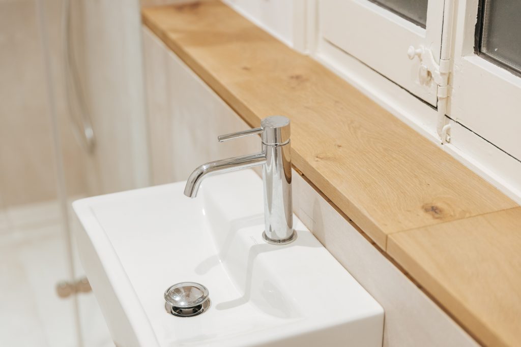
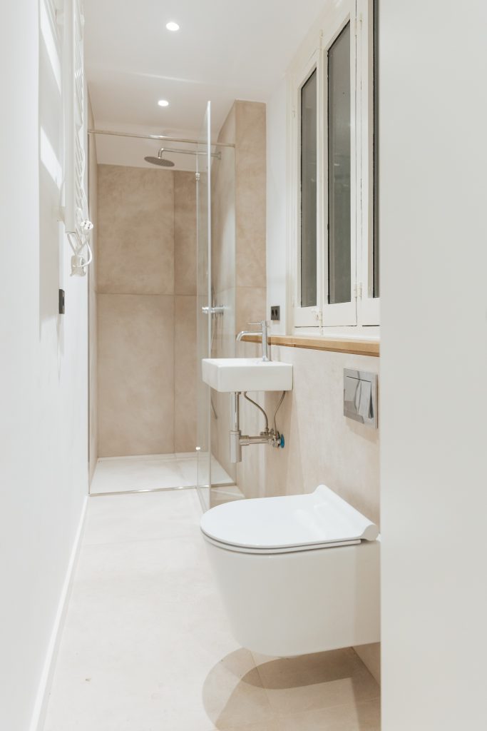
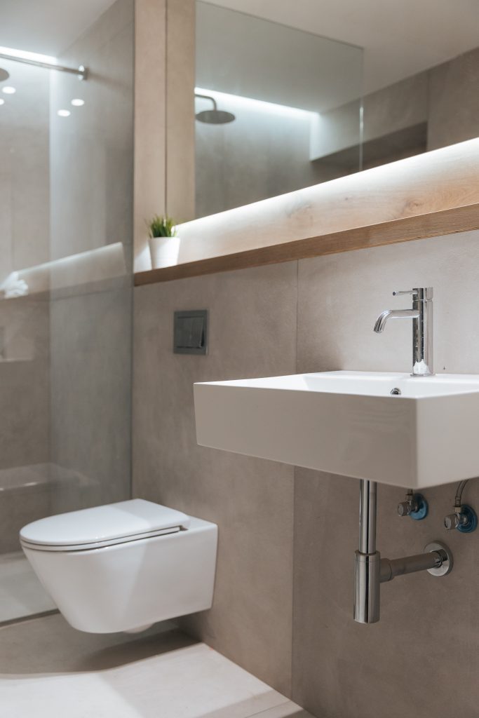
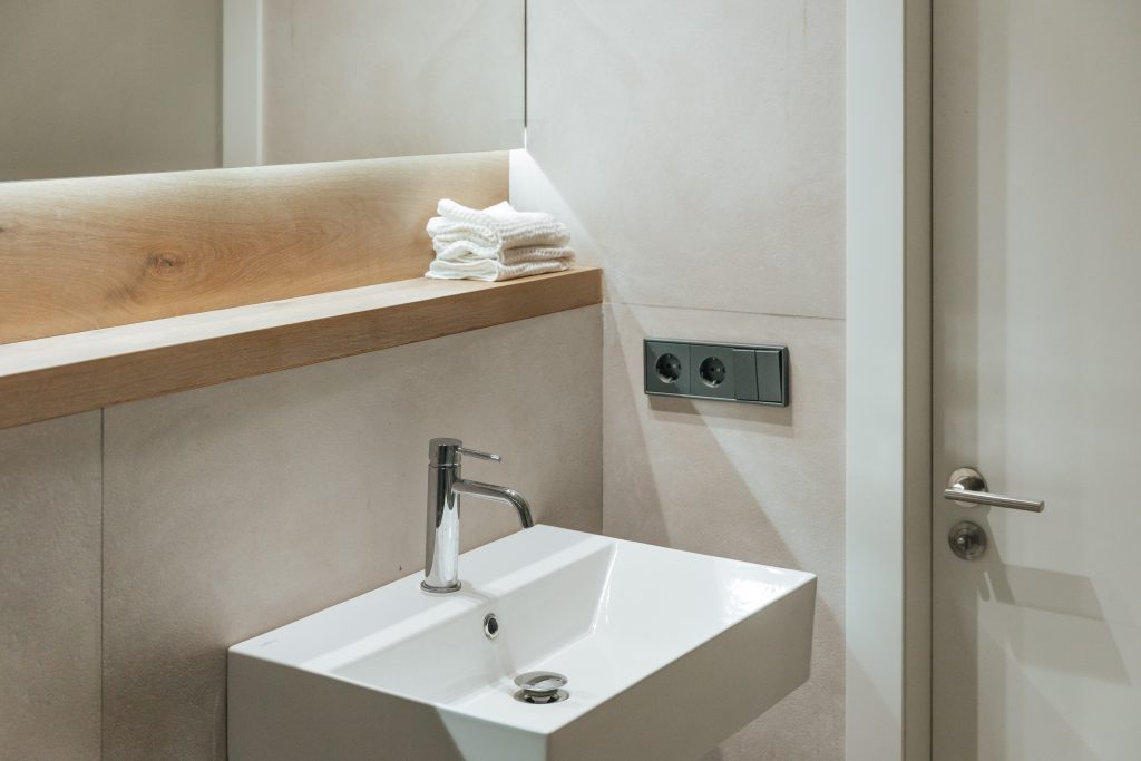
The other bathroom is an elongated and narrow space, for this reason it was decided to install wall-hung toilets that allow a lighter vision, for this reason the Paris washbasin is placed.
To achieve that same visual effect of cleanliness and lightness, in the third bathroom you can also find the Brussels 60 washbasin.


